5 Best Examples of Effective Mobile Website Design
- Created at:
- Updated at:
The smartphone, over the years, has proven itself to be a useful tool. So much so that in a 2019 survey by Statista, it was reported that there were 3.2 billion smartphone users worldwide.
This report goes on to forecast that in 2020 we will see this number reach 3.5 billion.
This just proves how important mobile devices have become and is reflected in Google’s Mobile-First Policy. What this policy means is that Google will more likely use a website’s mobile version to rank that website.
These numbers have seen even a larger boost during the ongoing pandemic. In a separate report from Statista, there has been an average 70% increase in worldwide smartphone usage. This can be easily understood given the situation.
This is important. As more and more people depend on their smartphones to search the web, website owners must ensure that they can deliver and meet these new demands.
What does this mean for you, the website owner? Well, it means you’d better pay attention to your mobile site.
It’s not simply a question of resizing everything. What this means is delivering the same information but in a smaller, neater package. You have to ensure that from the customer’s perspective, the content is coherent and easily navigable.
This might call for a full site audit. Don’t let this scare you. Doing the site audit means you can understand what needs to be changed and why. In this way, you can understand how you can improve your site’s rank.
Some simple things to watch out for:
- Slow loading times
- Images and videos not properly scaled to screen
- Thin pages
- Difficult navigation
With the coronavirus crisis, there is no better time than now to invest in your web design. The crisis won’t last forever but the benefits of your mobile optimization are long-term. Might as well start now.
To help you get started on your mobile site, we’ve compiled a few recommendations on sites and the reasons why they make good examples.
5 Examples of Effective Mobile Website Design
1. Ease of Navigation
The great thing about Big Sky Health is its beautiful aesthetic that works seamlessly with site content. Simply scrolling down through the homepage animates a simple line that follows the users’ position.
This goes hand in hand with the content that follows. The homepage is like a long ribbon.
As the user scrolls down, the site introduces the user to the story of the business, its vision, and finally their products.
What they did right:
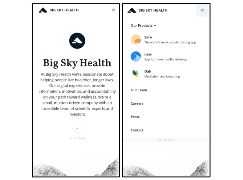
What stands out about this site is its ease of navigation. Given that they have three products, the site avoided overcomplicating its presentation.
Tapping the navigation panel presents all the main pages with an option to expand the products. From here, you can easily navigate through the site.
Additionally, the company is responsive to the fact that more people are searching on mobile devices. The website presents information about the company from the get-go and leads the user through their narration.
The problem that many websites have is that their mobile versions often look like cramped versions of the desktop site.
This isn’t the problem with Big Sky Health as the design itself seems to have been made for mobile.
2. Consistent content
The well-known sports brand, Adidas, is another one great example. Immediately upon opening their site, you are presented with the featured page as well as the basic navigation.
Just like their physical stores, the mobile site helps users view their products in a clear order. The site gives you the option to go through their catalog either by filtering by gender, age, sport, or brands.
What they did right:
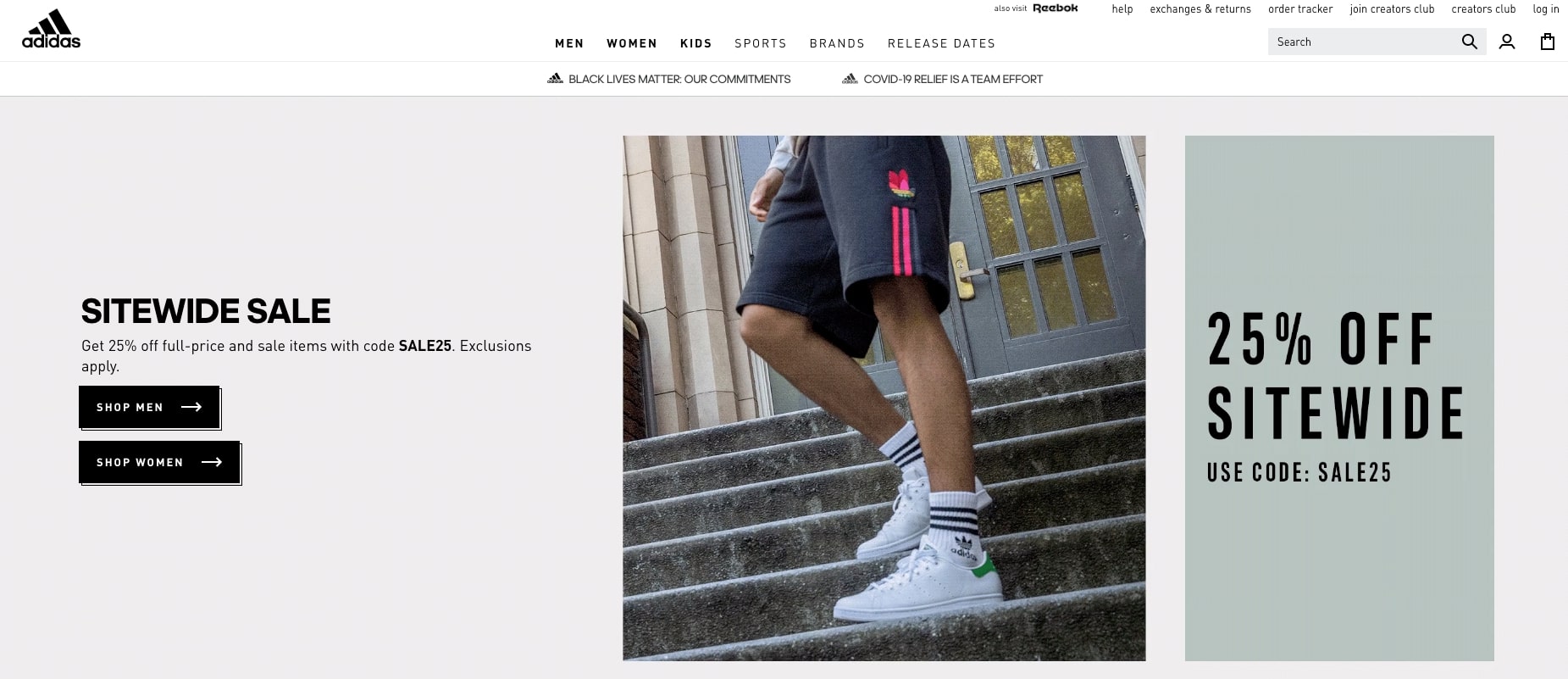
You can see how Adidas maintains the content on both desktop and mobile versions
What Adidas exemplifies is the consistency of their site content. On both mobile and desktop versions, the site presents its information in a clear, coordinated manner.
This is a significant move as consistency is one of the factors that Google themselves pointed out. While the different versions of the site do cater to different devices, the business message remains the same.
3. Keeping loading times short
CollegeRecruiter is a site that offers job finding services. With their site, the company focuses on that service by immediately presenting the user with a search form.
Navigation on the site is simple as well. A tap on the navigation panel will display all the pages in a neat and readable manner.
What they did right:
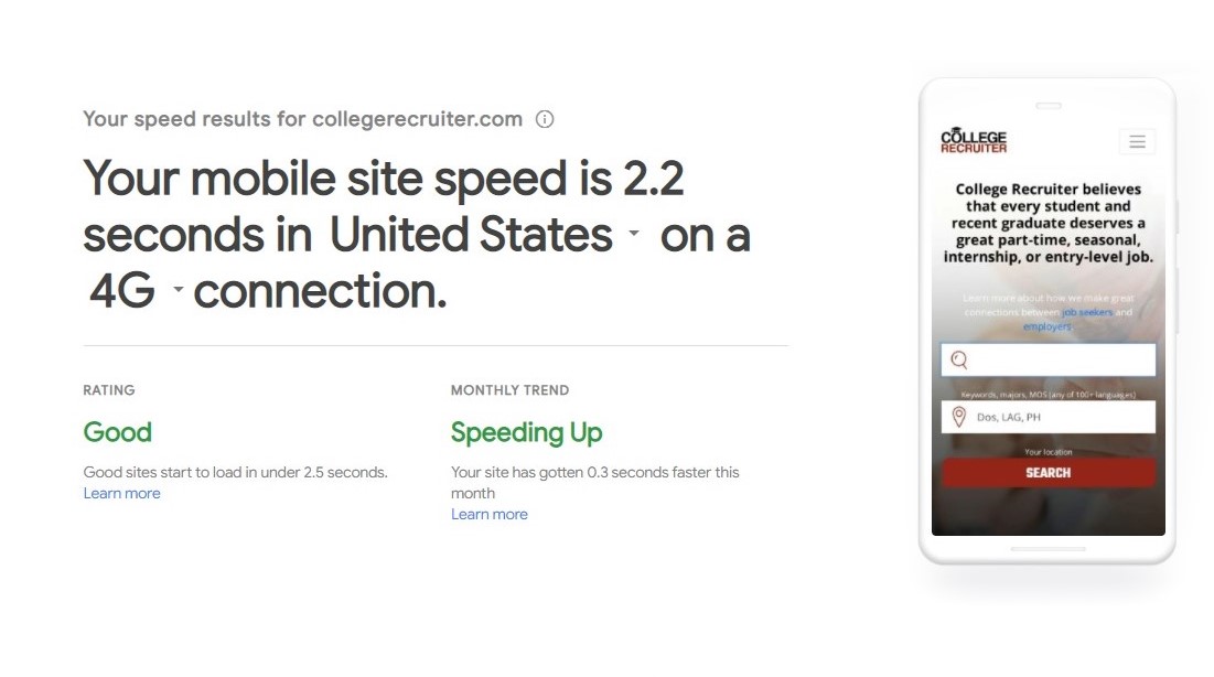
Using ThinkWithGoogle’s Mobile test tool, we can see how long it takes to load the site
CollegeRecruiter has one of the lowest loading times. This is an important factor when it comes to site ranking. With Google, sites that take longer than 2.5 seconds to load are considered less mobile-friendly.
It helps that CollegeRecruiter contacted a professional web design firm for this. With outsourcing, you are guaranteed a professional service that knows which boxes to tick when it comes to web design.
4. Clutter-free information
This is one non-profit organization that knows how to present itself.
One would think that an organization that aims to inform and educate would have loads of text. Ocean Data Alliance’s home page gets creative with how it hides and presents that text.
What they did right:
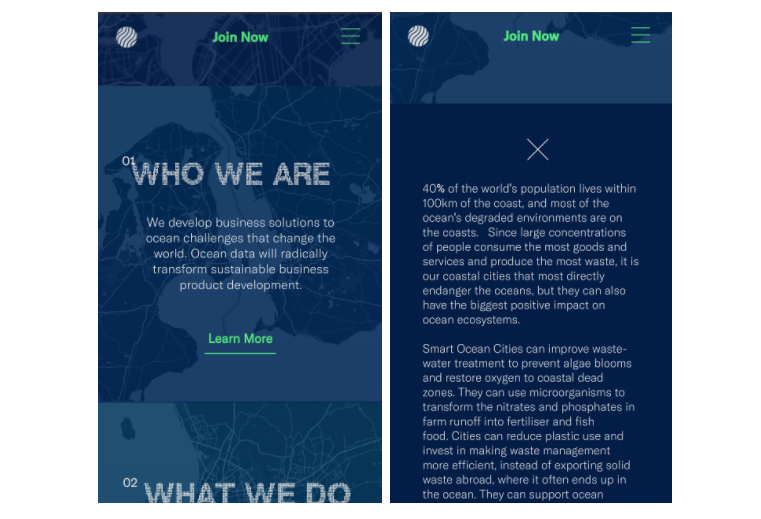
What they did right with this page is they found a way to stay informative without the clutter. The simple use of a “Learn More” button allowed the site to keep the home page clear of clutter and easier to navigate.
Additionally, users did not have to load a whole new page just to get this info. This matters a lot with user experience as people simply would prefer not to wait.
This is one way of prioritizing the user’s experience without sacrificing information.
5. Responsive web design
Let’s take a school website as an example this time, Morristown-Beard School. While wordier than some mobile sites, it still maintains a clear and organized structure due to its use of panels.
With these panels, information is easily sorted and identified. Being a school website, they must be able to share their institution’s benefits immediately.
What they did right:
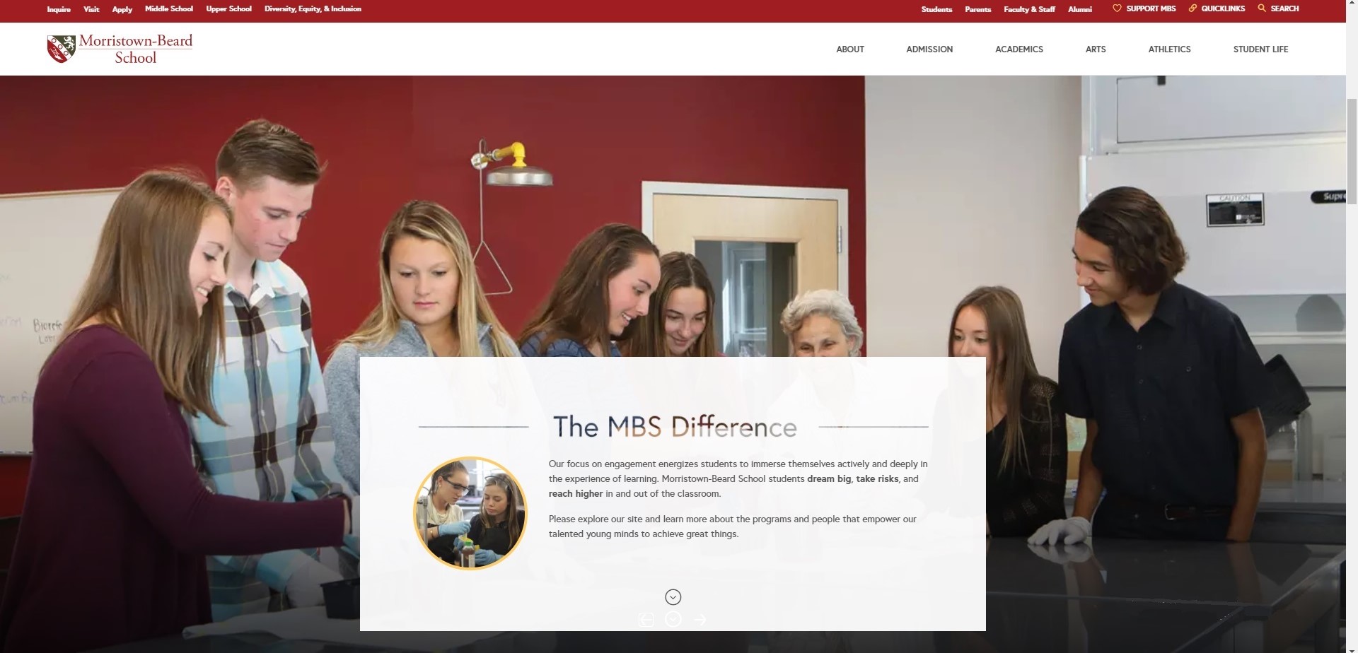
The creative use of an overlaid card with text changes when viewed on a mobile device
What’s special about this site is how it’s so responsive. In the image above, you can see how the desktop version of the site has adapted for the mobile version.
Instead of making it difficult for the user, the website instead separated the card with the text from the background collage.
While it did step away from the creativity of the overlaid text-card, it allows users to a.) load a smaller video, and b.) easily read the text from a smartphone.
This is a trait of a well-designed site. A responsive site will allow users to experience the different versions of the site similarly, if in a more compact manner.
Conclusion
Noticed any patterns? Well, the main point is that each of these sites aimed to make the user experience more enjoyable.
In summary, here’s what we picked up from each example:
- Easy navigation
- Consistent content
- Fast loading time
- Informative without the clutter
- Responsive website
At the end of the day, it depends on your audience and how you want to talk to them. Is information your priority or aesthetics? No wrong answers here, it just depends on how you plan everything out.
Some tools
The internet is full of tools to help you out on your optimization journey. It might even get a little confusing when thinking about which one to use.
To help you out, here are a few free tools to get you started:
Mobile-Friendly Test
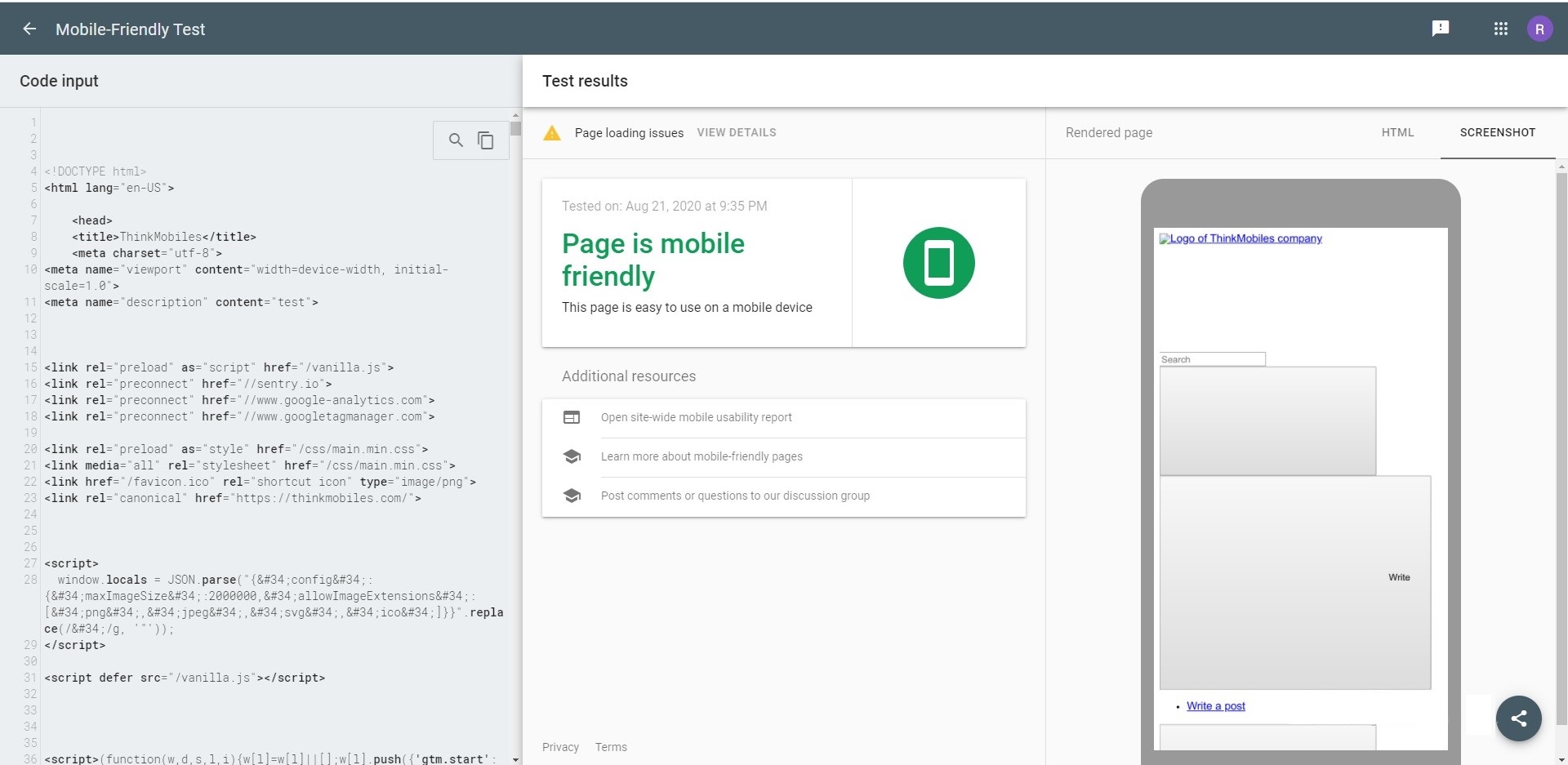
Mobile-friendly Test is a free tool from Google. It’s a component of the Google Search Console and as such it allows developers to test their mobile sites through either code or URL.
The goal of this tool is to figure out whether your site is mobile-friendly. That is, if it's easy to use for people on mobile devices. It displays a simple rating along with a screenshot of your above-the-fold content.
Test My Site by Google
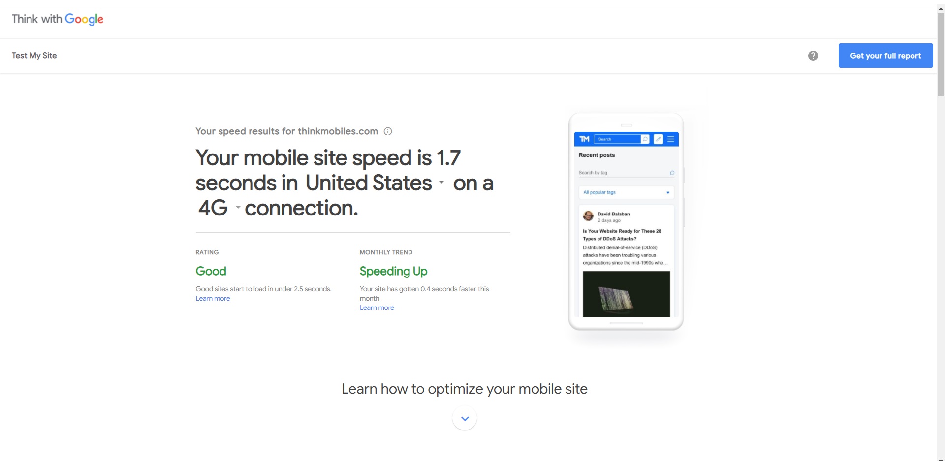
Another free tool from Google. This tool gives you a rating based on how long your site takes to load on mobile connections.
An additional feature is that it gives you the trend on your site loading times. Aside from that, the tool links you to resources on how to optimize your site for mobile devices.
Resizer
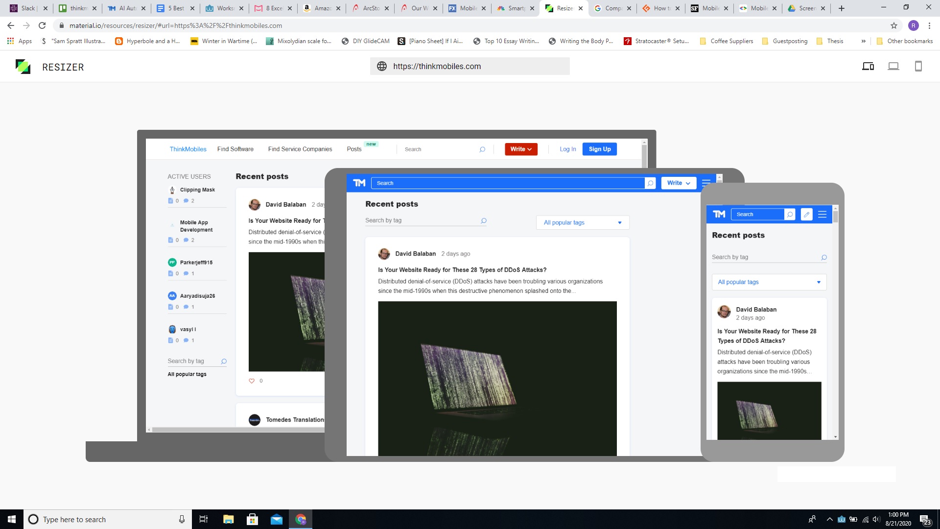
This tool allows you to see just how responsive your website might be. Simply type in your URL and the tool loads your site right up.
It displays your content through any of the three devices. It even allows you to scroll through your page to see how users might interact with it.
Think about your audience
The trick is to never forget about your audience. Remember, this is about them, not you. Your website is how your business speaks to your audience.
Keep the users’ comfort and convenience in mind when undergoing your web design/redesign. It’s a tedious process that might take time and money, but its benefits are long-term and high impact.
Dan has experience in digital marketing since 2007
Popular posts
-
7 WordPress Maintenance Tasks to Avoid Technical Nightmares
- 0
- 0
-
How to Boost Conversion by Gaining Insight Into Your Users
- 1
- 0
-
How to Build Reporting APIs Better, Stronger and Faster
- 1
- 0
-
10 Best Apps that Help You Boost a Conversion Rate of Shopify Store
- 2
- 0
-
Is Flutter Likely to Replace Java for Android App Development?
- 0
- 0
-
How to clean PC (Windows 10 mostly)
- 0
- 0