The Complete UI/UX Guide for Magento Stores
- Created at:
- Updated at:

Like it or not, consumers have become more demanding. Maybe it’s the growing competition in e-commerce that is to blame, or consumers just want the best experience when buying online. More often, it’s two of these reasons combined.
Eager to please their customers, e-commerce business owners started investing in the user interface and user experience of their Magento stores. That’s why you’ve probably noticed the abbreviations UI and UX being on everyone’s lips over the past couple of years.
But what does it actually take to optimize the user interface and user experience for an e-commerce business? We’ll attempt to answer this question today in our complete UI/UX guide for Magento stores.
Step #1: Start Your UI/UX Checkup from Navigation
First and foremost, go to your website and evaluate its general look. Is it easy to move from one section of the store to another? Are all the sections logically categorized? If you’re hesitant about the answer, it’s time to revisit the navigation of your Magento store.
There are a few navigation elements that a Magento store should have:
- brand logo linked to the home page
- clickable user account
- clickable shopping cart/subscription element
- main menu with categories
- breadcrumbs
- layered navigation
Now, the brand logo with a link, clickable user account, and shopping cart are all standard elements your store probably already has. However, adding the other three elements – categorized menu, breadcrumbs, and layered navigation – can significantly improve the UI of your Magento store.
How? Layered navigation is a standard filtering feature in Magento. It is placed on the category page and offers a variety of filters. If you include this feature in your website navigation, your customers will have an easier time finding the right product, hence, a more enjoyable shopping experience.
One more navigation feature left is breadcrumbs, which tell your customers where they currently are on your website. Even though this feature is hardly noticeable, breadcrumbs actually play an important role in making the navigation around your website easier. With breadcrumbs, store visitors can easily switch between the pages of your website. This feature also simplifies product search.
As you can see, including just three additional Magento navigation features to your store can significantly improve the shopping experience on your website. Even small elements like breadcrumbs can help you convert more visitors to buyers since the shoppers will have easier access to all your product categories. Plus, your website will look more structured.
Step #2: Consider the Layout of the Website Elements
You already know that the general design of your store also impacts the user experience – a whopping 75% of customers judge online stores just by their aesthetics.
Yes, but what does ‘aesthetics’ mean in this case? By an aesthetically-pleasing web design, we mean the layout of website elements that are located logically and don’t overcrowd each other. Thus, these elements don’t overshadow each other’s functions.
To make sure that all website elements are located properly, UX designers use something called negative space, and it can significantly improve the overall look of your Magento store.
Basically, negative space is the area between website elements that’s left empty. Kristin Savage, a writer and flashcard designer at Subjecto, says that negative space serves several important goals that impact the user experience:
- defining the limits of the objects on a website
- emphasizing the functions of each website element
- bonding all website elements into one cohesive whole
Creating a website layout using the negative space is a pretty straightforward task – you allocate the elements with a space between them. However, you can also do it in a more creative way.
For instance, Byredo, an online perfume shop built with Magento, used the pictures of their products made on the white background for the product menu:
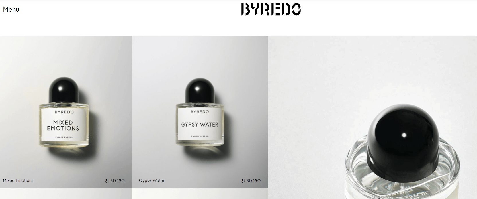
Credit: Byredo
As you can see, the website looks stylish, all products are well-displayed. And even though there is no actual negative space, the idea of it is preserved.
Even though using the negative space can significantly improve the UI/UX of your Magento store, you can definitely overdo it. Just take a look at the example of Vortex.com:

Credit: Vortex
This website is basically one big negative space. And, even though negative space is supposed to define the structure of the website, there’s barely any structure in this case.
That’s why, when working on the UX of your Magento store, don’t forget about the logical position of all website elements and use negative space as a tool to define their functions.
Step #3: Take Advantage of Magento’s Search Bar
Even those who only have a slight understanding of Magento know that the coolest feature it can help you build is a search bar. Yes, something as random as a search bar can be one of the standout features of your Magento store because it literally takes online shopping to the next level.
Let’s take a look at a few examples.
Helly Hansen, a winter clothes brand with an online Magento store, uses an interactive search bar with a built-in product search engine. Basically, you type in the keyword and get product results without being redirected to a separate landing page:
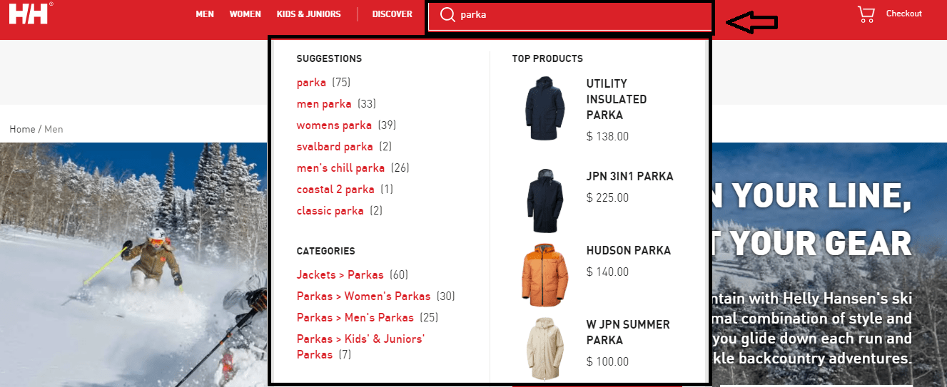
Credit: Helly Hansen
You can also see that the dropdown menu shows different search suggestions and categories, narrowing down search results. Such a feature is also often used by tech blogs and websites that sell different electronic devices because it helps their customers check quickly whether the product they are looking for is in store or not.
Another option is a search bar with layered navigation. Reserved, a European clothing brand, has this feature on its website built with Magento:
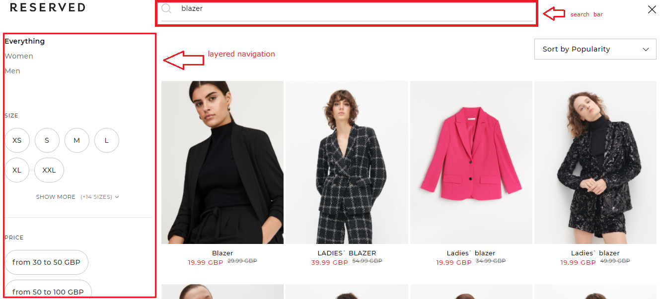
Credit: Reserved
Basically, this search bar works like a landing page with several filters. It allows customers to give a better look at the products and customize their search.
There is no point in debating the impact of such a search bar on the UI/UX of your Magento store, especially if you sell a wide variety of products. The results of the product search change in real time as you type in keywords. As a result, the waiting time on a website is also significantly lower, which is a big perk for a positive user experience.
Step #4: Optimize Your Lead Generation Tools
Websites often use a variety of tools to attract new customers or, in other words, for lead generation and nurturing. These tools are also known as lead magnets, and their goal is to spark a customer’s interest in a brand and capture it.
Among all the possible options, e-commerce websites often use different kinds of pop-ups and lead generation email templates that collect contact information from potential prospects and offer something valuable in return (usually, a discount code).
For instance, here’s an example of a lead magnet from Holo Taco, an online nail polish brand that’s offering exclusive discounts in exchange for an email subscription:
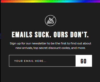
Credit: Holo Taco
But even though lead magnets serve an important goal helping you grow your business, they can sometimes negatively impact the user experience. For instance, pop-ups often overcrowd the main content, make the page load longer, or are unresponsive and impossible to close.
So, if you’ve noticed that your visitors are bouncing soon after they enter your home page, check if your pop-ups or other lead magnets don’t distort their shopping experience.
Step #5: Check if Your Magento Store is Mobile-Friendly
If you remember our section about the importance of UX and UI for the success of your Magento store, we mentioned that 48% of consumers would leave a mobile website if it’s unresponsive. And responsiveness is where many e-commerce businesses miss out.
It’s not a surprise that today more and more people are shopping via their smartphones and tablets. It’s convenient – you can do it on the go and at any location.
Naturally, if a website is not mobile-friendly, it will take longer to load, and the overall user experience will be ruined. That’s why investing in the responsiveness of your Magento store is a crucial step in optimizing its UI and UX.
There are three elements in Magento that are responsible for the responsiveness of a website:
- CSS3 Media Queries –CSS styles that can adapt to the device through which a customer views your website.
- Flexible images – allow resizing visual content according to the device.
- Fluid Grid Layouts – enable sizing all other layout elements on a website.
When it comes to making your website mobile-friendly, your task is to also make it adjustable to different screens. The elements mentioned help make this happen.
Another aspect that isn’t connected to Magento but can severely harm the UX of your Magento store is cybersecurity and how safe your customers are when browsing your website.
When shopping at your online store, customers share a lot of sensitive information, including payment details. That’s why it is so important to invest in the cybersecurity of your website – all sensitive information shared by your customers must be well-protected.
One of the ways you can do it is by switching to HTTPS protocol that encrypts all transactions. You can also enable two-step verification for the customers who have accounts on your website to make sure that somebody unauthorized doesn’t access their private information.
UI/UX Guide for Magento Stores: Recap
Building a Magento store (and any e-commerce store in general) means investing in UI and UX right away. Failing to do so can cost you your customers, authority in your niche, and ultimately your business as well.
So, make sure that your Magento store is user-friendly by including the following elements:
- proper navigation with categorized menu, layered navigation, and breadcrumbs
- all website elements are logically organized and highlighted using negative space
- store has a highly responsive search bar
- lead magnets don’t overcrowd the main content in your store
- website is mobile-friendly and secure.
Writer
Popular posts
-
5 Best Examples of Effective Mobile Website Design
- 4
- 0
-
How to Build Reporting APIs Better, Stronger and Faster
- 1
- 0
-
Top 4 Examples of Great User Onboarding Design
- 0
- 0
-
Challenges of adapting blockchain to the Internet of Things
- 0
- 0
-
Who should be held responsible for a customer data breach?
- 0
- 0
-
13 Best Employee Management Software Tools for Small Businesses
- 5
- 0