We are currently witnessing how web designers cope with the challenges of fast-developing technologies. Their job is to create websites that are approachable, distinct and fresh, tailored to the brand tone, adaptable to any devices and plainly just beautiful. In the whirlwind of our daily tasks, we paused for a moment and thought what are the web design trends?
In 2017, we could see that mobile browsing finally defeated desktop usage. This means that we are going to see a more intense development of mobile functionality while web designers shouldn’t forget about desktop to stay significant. Considering all these factors, let’s check out the trends which will define website look in 2018.

Get free estimation for your web app
Post your project or request a dedicated team - we'll quickly match you with the right experts.
Top web design trends
Below you will get acquainted with tendencies in 4 areas: layout, background, typography and color scheme. To sum it up briefly, those trends are as follows:
- Layout: asymmetric grid, mobile-friendliness;
- Backgrounds: particle background, custom illustrations, animations;
- Typography: bold and big;
- Color scheme: bright colors, dynamic gradient, shadows.
Let’s put some meat to the bones.
1. Asymmetric and broken grid
The old myths about the layout framework have been broken in 2017 and the new era of escaping from the rules began. The interest to the broken grid layout is that it is experimental, novel and recognizable. The companies that want to cut through the clutter are ready to play with the layout of their websites. Traditional and small companies will not be interested in such experiments, but bigger brands that can afford themselves to be a little risky are more likely to agree to use offbeat ideas.
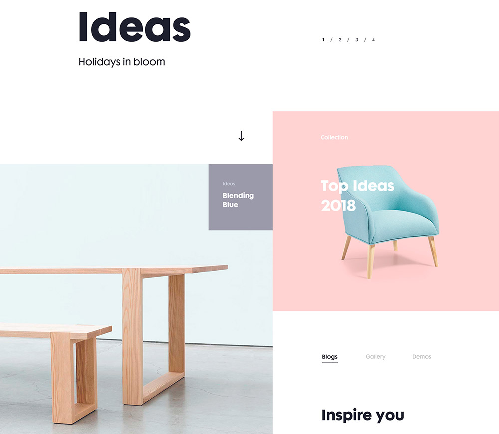
Image credit: Daniel Tan
2. Mobile first
Mobile browsing has doubtlessly defeated PC. Almost every person shop and browses on their phone. Earlier it was not so convenient, but designers quickly adapted to new tendencies and created menus that are readable on a small screen. Designers simplified the icons and made them smaller, so the users have no difficulties to understand them even on the small screens. Micro-interactions create a dynamic tone of user interfaces. They made the visit on the page easier and users don’t need to scroll down through the whole the page.
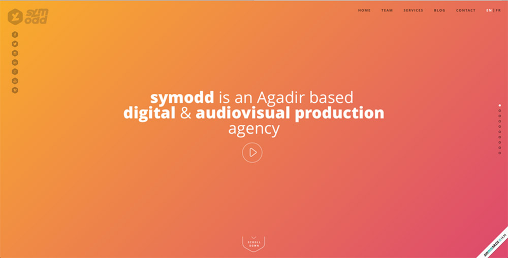
Image credit: Symodd
3. Particle background
Particle background is a great solution to the companies who use videos as the background on their web page. The animation is lightweight JavaScript that allows creating movements without taking too much time to load. One image says more than thousands of words. What effect can make a moving one? The particle background grabs user’s attention like a shot, so the brands can use it as a tool to make a first memorable impression of themselves in just a few moments.
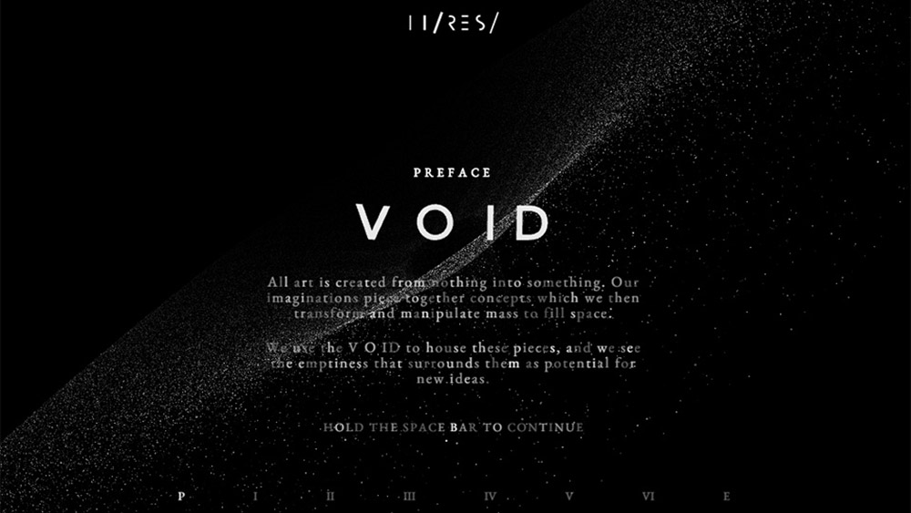
Image credit: Hi-res.net
4. Custom illustrations
Custom illustrations add a playful, friendly and energetic tone to the website. Artists can help brands to express their personality with the help of illustrations, which will make the website more approachable for the customers. This trend is more appropriate for the brands who want to add an element of fun to their website, but at the same time, it can help companies who are commonly perceived as reserved and classical gain more open-minded audience.
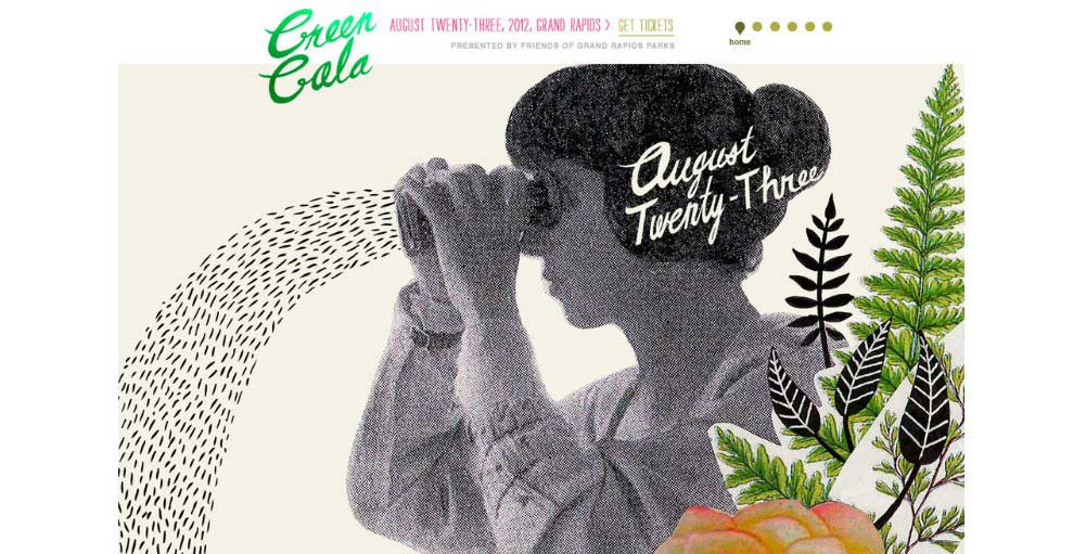
Image credit: Frances Close
5. Integrated animation
The difference between particle backgrounds, which were mentioned earlier and integrated animation, is that the first one covers only the background, while the integrated animation helps to engage a customer throughout his whole experience on the page. Integrated animation can help to focus the attention of the customer to the necessary point on the website. If you are interested in it only as a fun abstract visual, it still can help you to communicate your ideas in easier and more approachable way.
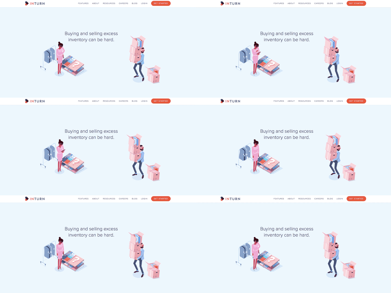
Image credit: Inturn.co
6. Big bold typography
Typography is another powerful visual tool to impress, create the character and convey important information at the same time. Almost all browsers support hand-made fonts thanks to CSS, so there is no limit anymore. The trend of big bold fonts, contrast Sans Serif and Serif page headers create energetic parallels, develop UX and engage your visitors to stay on your web page. Heading is a key element of SEO for web pages. It helps to order information and make scanning easier for the visitors. A highly functional website can convey the information using only words and almost no visual aids.
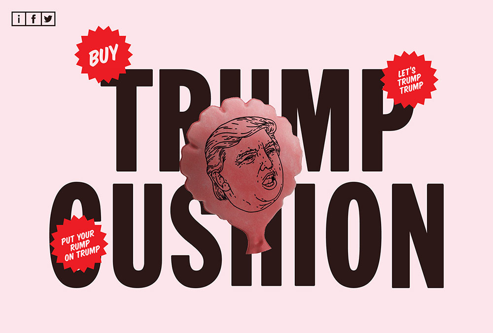
Image credit: One Page Love
7. Bright and vivid colors
2018 is definitely the year for color explosion online. This is partially influenced by the technological development of the devices. The screens are now more sensitive and can reproduce richer colors. Many new brands along with more experienced ones no longer intend to use safe colors and web designers become more daring in use of color. It’s especially useful for new brands to use vibrant colors to grab the attention of the users, but it also fits brands who want to set apart being traditional and typical.
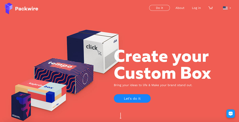
Image credit: Packwire.com
8. Dynamic gradient
We can be witnesses of coming back of gradient in 2018, as one of the web design trends again. Previously we could see the gradient in the form of shading to present 3D. Now gradient is large, loud and rich in color. The most popular usage of gradient now is over photos, which is a witty way to make an ordinary photo look appealing. Another simpler way is to use the gradient background if you don’t have other images to work with.
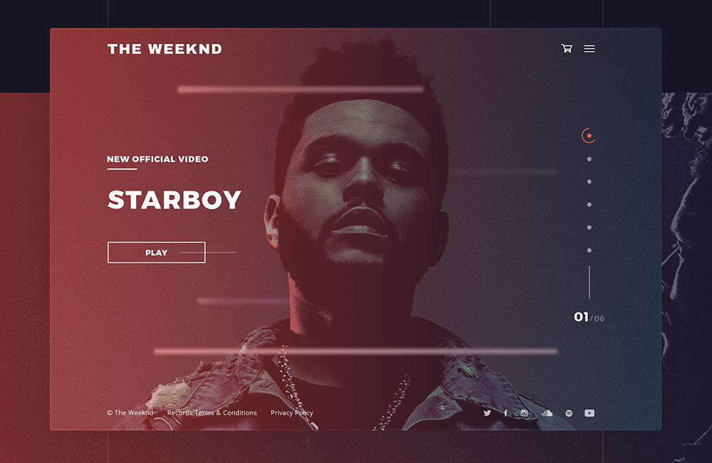
Image credit: TheWeekend.com
9. Shadows for extra depth
Shadows are not new in the world of web design. However, shadows are the core of web design and now we come across many variations of it. To create depth and illusion beyond the screen web designers use parallax and grids. Designers started to play more with shadows as a reaction to a long-lasted tendency to a flat design. Designers use shadows and colors to make CTAs seem raised and to set a visual hierarchy between the elements. Therefore, the usage of shadows helps to emphasize and grab user’s attention to important points on your web page.
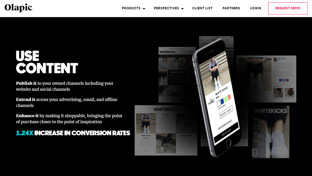
Image credit: Olapic.com
Summing this all up, 2018 is aiming to be the funniest year in web design. It’s curious how web designers will cope with the challenges and where their experiments will lead.

Get free estimation for your web app
Post your project or request a dedicated team - we'll quickly match you with the right experts.

